
Why Color Temperature Matters More Than You Think
Two rooms can be fitted with the same LED fixtures, the same wattage and the same installation detail, yet feel completely different. The variable that usually explains the difference is color temperature. Measured in kelvin (K), it describes whether white light leans warm and golden or cool and crisp — and in linear lighting it shapes how materials, finishes and even food look.
For anyone specifying COB LED strip, neon flex or cabinet lighting, color temperature is one of the few choices that changes the atmosphere of a project more than the hardware itself. This guide explains what 3000K, 4000K and 6000K actually look like, where each one belongs, and how to specify them correctly.
What Is Color Temperature?
Color temperature is not the temperature of the light source. It is a way of describing the color of the white light a source produces, expressed on the kelvin scale. The lower the number, the warmer and more amber the light appears. The higher the number, the cooler and more blue-white it appears.
For architectural and decorative LED lighting, three ratings cover the vast majority of projects:
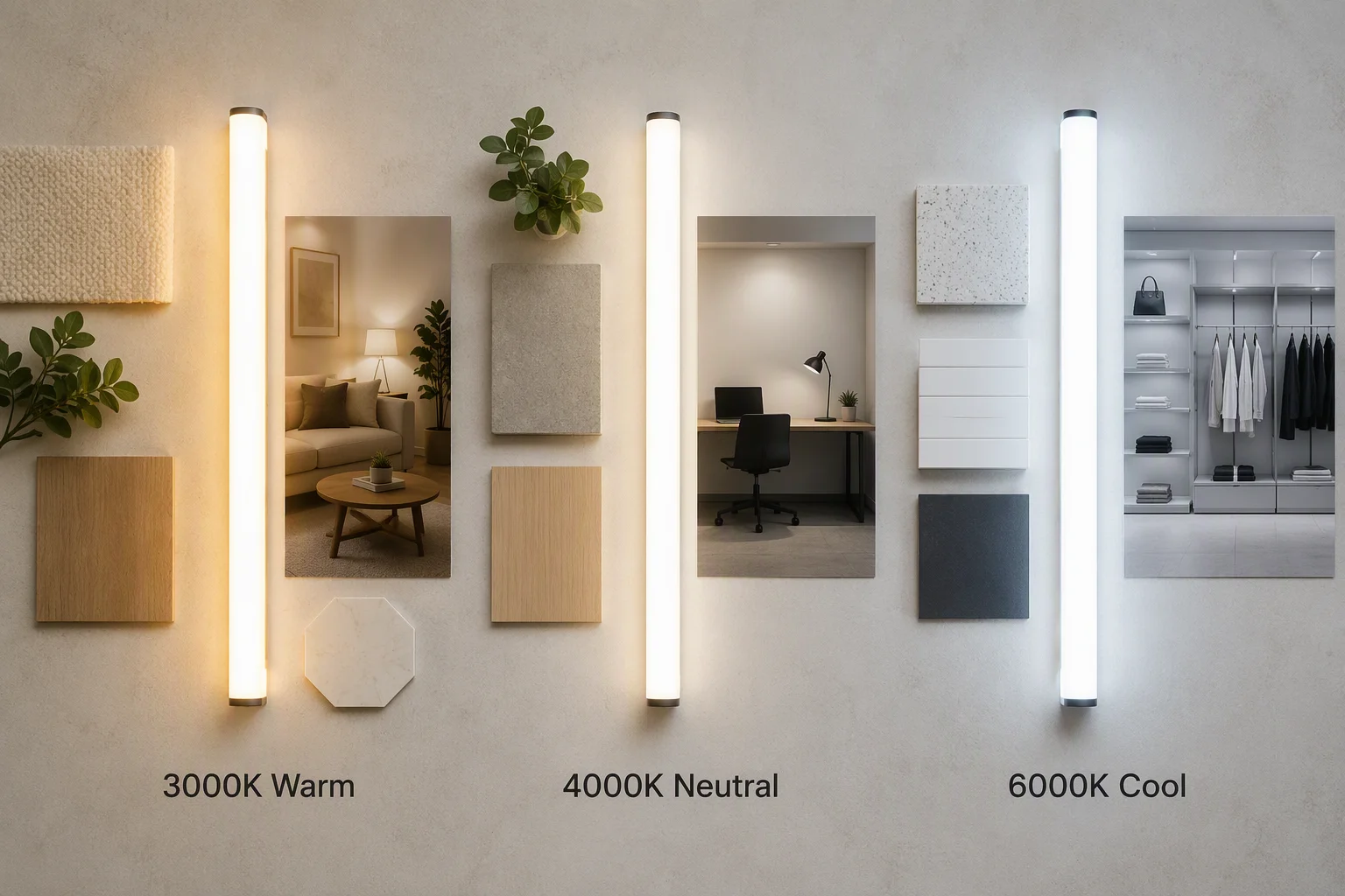
3000K — Warm White. A golden, comfortable white similar to traditional halogen. It softens skin tones and wood grain, and it is the default choice for relaxed residential interiors.
4000K — Neutral White. A balanced white with almost no amber or blue cast. It reads as clean and natural, which is why it dominates offices, showrooms and task areas.
6000K — Cool White / Daylight. A crisp, blue-tinted white that imitates overcast daylight. It maximises perceived alertness and contrast, and it is common in industrial, display and outdoor applications.
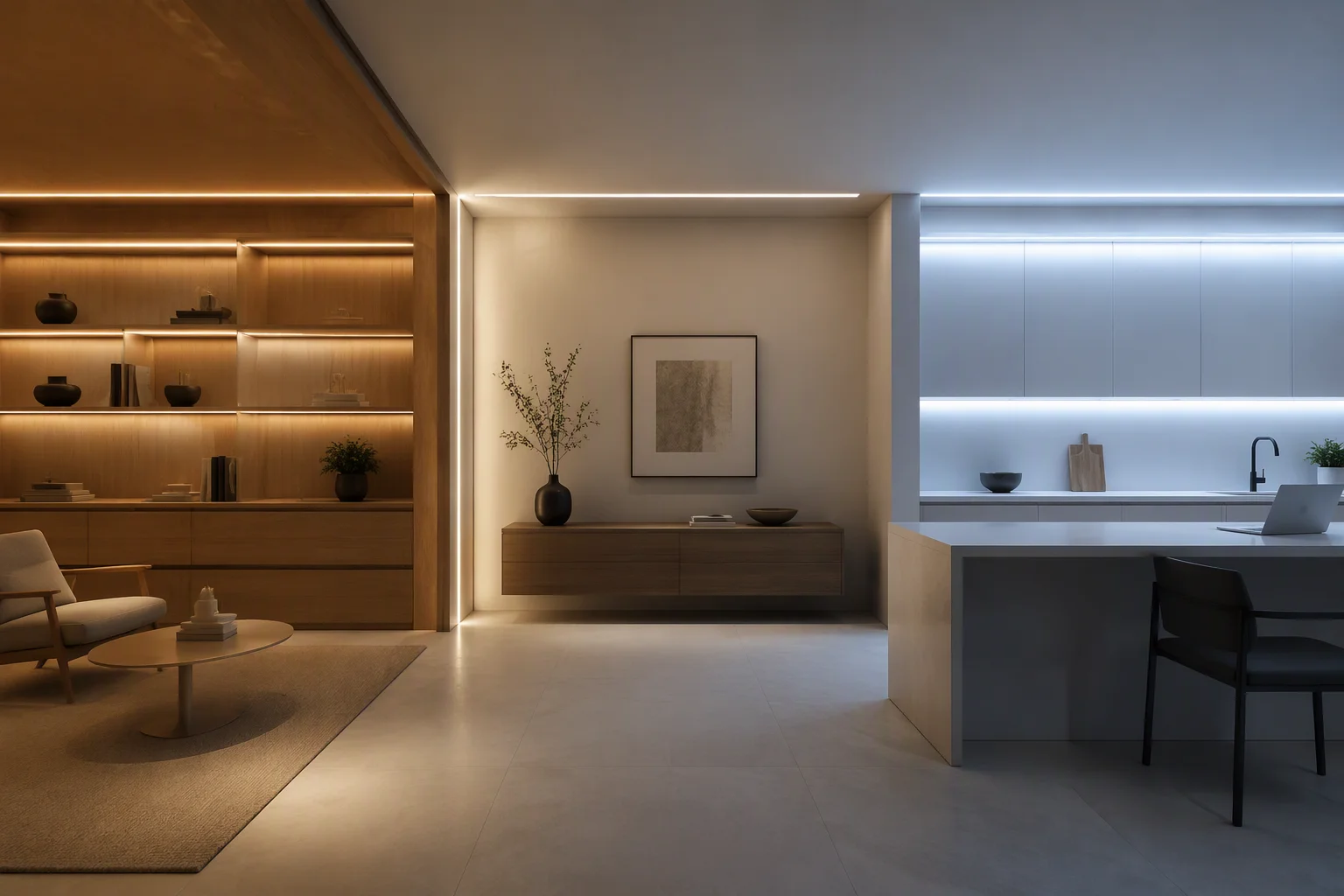
3000K: Warm White for Comfort-Led Spaces
3000K is the most familiar indoor white. It sits at the warm end of the scale and produces a soft, inviting glow that makes a room feel finished rather than simply lit.
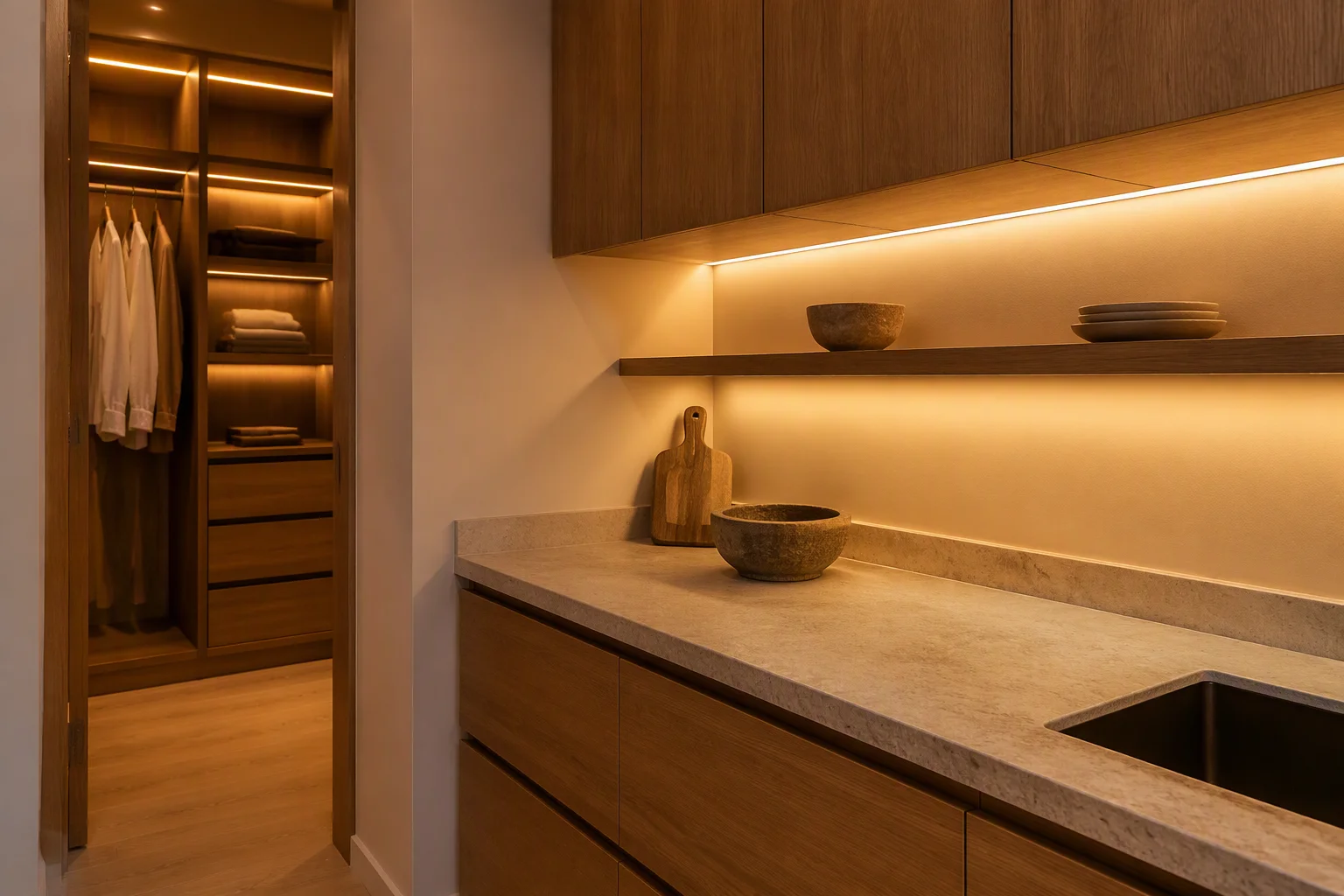
Where 3000K works best
Living rooms, bedrooms and hotel guest rooms benefit most, because the goal there is relaxation rather than maximum visibility. 3000K is also a common choice for under-cabinet kitchen lighting and wardrobe interiors, where a warmer tone flatters wood veneers, stone and fabric. In hospitality projects such as restaurants, bars and lounges, it is the tone that keeps a space intimate after dark.
One practical caution: at very low output levels, 3000K can read slightly amber. If precise color rendering matters, pair it with a high CRI rating rather than assuming the kelvin value alone will carry the look.
4000K: Neutral White for Task and Retail
4000K is often described as natural or neutral white. It is close to a bright, lightly overcast afternoon, and it is deliberately unemotional — which is exactly what makes it useful.
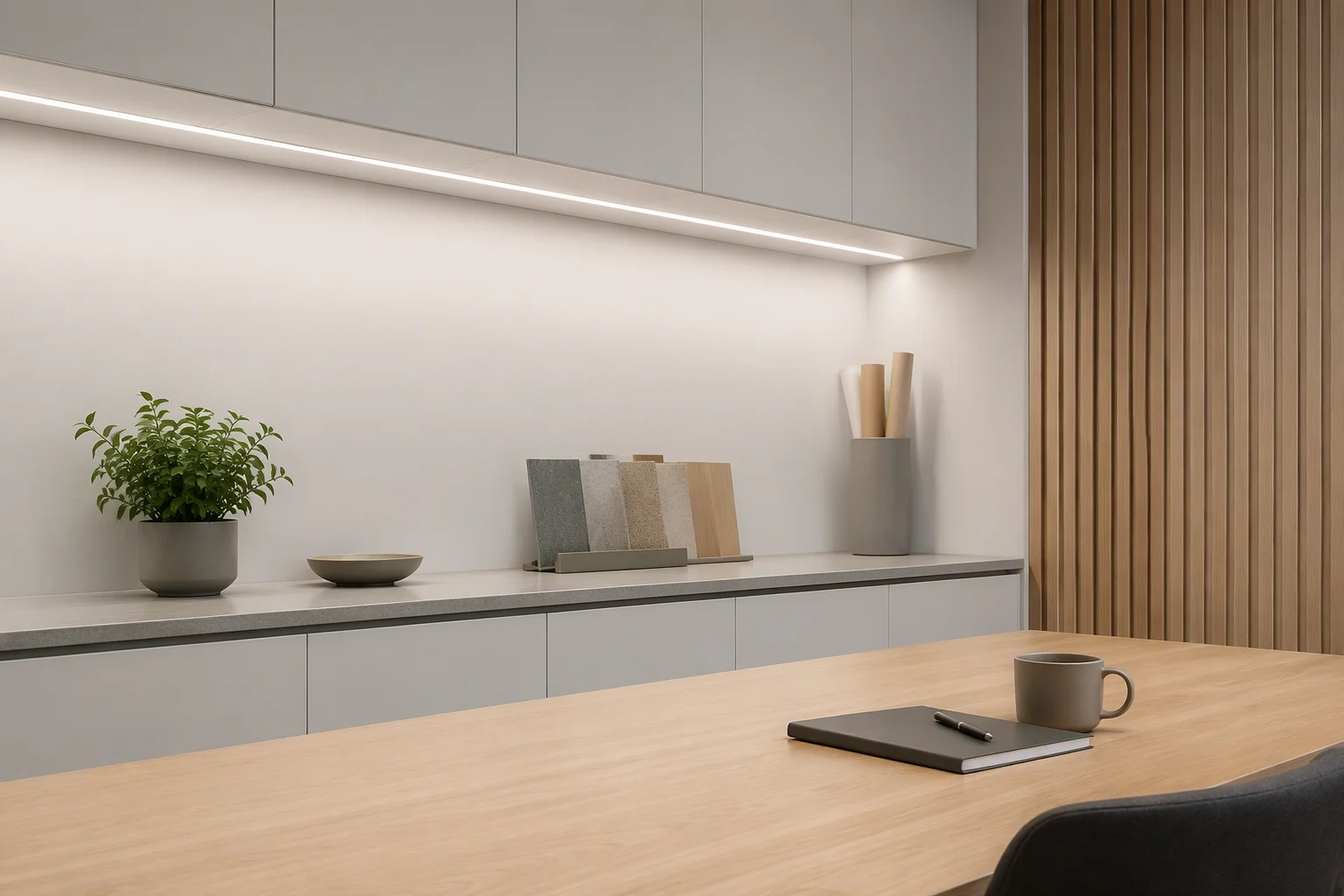
Where 4000K works best
Offices, conference rooms, showrooms, supermarkets and retail display lighting all rely on 4000K because it keeps colors close to how they appear in daylight without the blue cast of higher ratings. It is the safest choice for merchandise, where a warm tone can make white packaging look beige and a cool tone can make it look grey.
In residential projects, 4000K suits kitchens, bathrooms, laundries, garages and home offices — rooms where people work, read labels or make decisions rather than unwind.
6000K: Cool White for Clarity and Contrast
6000K is a crisp, blue-white tone that resembles open daylight. It delivers the highest perceived contrast of the three, which increases the sense of alertness but also reduces warmth.
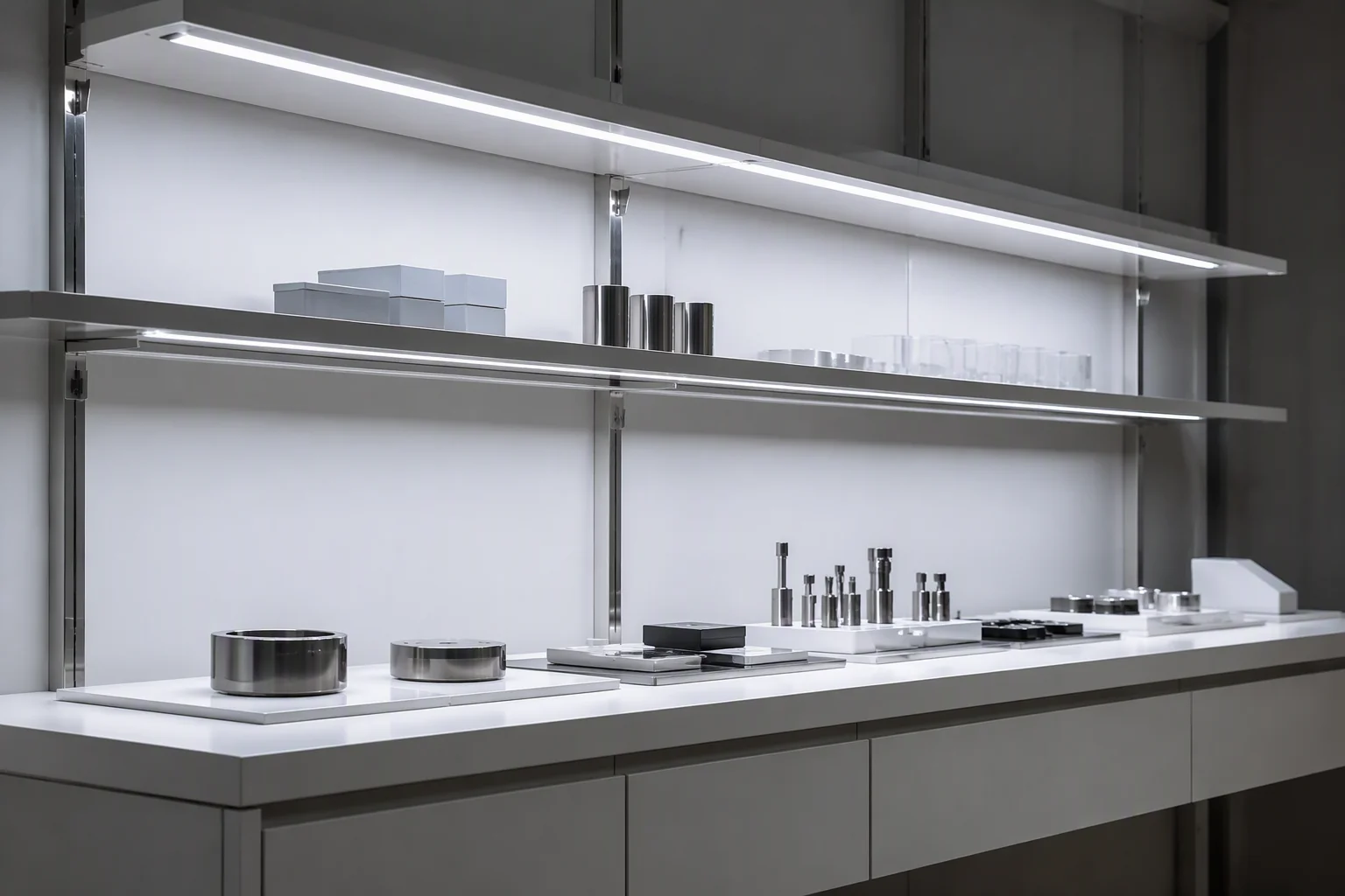
Where 6000K works best
Industrial halls, warehouses, laboratories, car parks and outdoor architectural highlighting are typical applications. 6000K is also used for display graphics and signage where crisp brightness matters more than comfort.
In residential settings, 6000K should be used sparingly. Applied across a whole living area it tends to feel clinical or harsh; used as accent lighting in a utility room, garage or basement, it works well.
3000K vs 4000K vs 6000K at a Glance
3000K — Warm White. Appearance: golden and cosy. Best for: living rooms, bedrooms, hospitality, wood and natural finishes.
4000K — Neutral White. Appearance: clean and natural. Best for: offices, kitchens, bathrooms, retail display and task areas.
6000K — Cool White. Appearance: crisp and blue-white. Best for: industrial spaces, car parks, outdoor highlighting and utility areas.
A Room-by-Room Selection Guide
Living room. 3000K for ambient layers; keep the same rating across cove and shelf lighting so the room reads as one design.
Kitchen. 4000K for general and counter illumination, with 3000K acceptable inside display cabinets for a warmer accent.
Bathroom. 4000K on mirror and task zones; 3000K if the space is used mainly as a relaxation area.
Bedroom. 3000K throughout, and dimmable wherever possible.
Home office. 4000K reduces the contrast between screen and surroundings and is easier to work under for long periods.
Retail and showroom. 4000K as the default; step up to 6000K only when merchandise or graphics call for sharper contrast.
Restaurant, hotel and bar. 3000K, ideally with dimming, to keep the atmosphere warm as light levels drop.
Warehouse, workshop and car park. 6000K for maximum perceived brightness and contrast.
Beyond Kelvin: Three Specifications That Change the Result
Color temperature is only one variable. Three others frequently decide whether a project looks right.
CRI (color rendering index). A light source can be the correct kelvin value and still make colors look dull. A higher CRI means colors appear closer to their appearance under natural light, which matters wherever food, fabric, artwork or skin tones are on display.
Consistency across a run. Color temperature should be checked across the whole batch and matched between the strip, any extension lengths and any accessory lighting. A visible shift along a single run is one of the most common complaints in linear lighting projects.
Dimming behaviour. Some drivers shift noticeably warmer as they dim while others hold their kelvin value. If you are pairing 3000K with a dimmer for an evening scene, confirm the dimming curve rather than assuming it stays constant.
Common Mistakes to Avoid
Mixing ratings in one sightline. Two different color temperatures next to each other almost always look like a mistake, even when each is fine on its own.
Choosing by number instead of by room. A higher kelvin value is not brighter, it is cooler. Brightness is a function of output, not of color temperature.
Specifying too late. Color temperature should be fixed before production, because it usually cannot be changed after the strip is assembled.
Ignoring the environment. A 4000K strip under a warm timber cabinet will look different from the same strip in a white-painted room. Always judge a sample in the actual space.
Frequently Asked Questions
Is 3000K or 4000K better for a kitchen? 4000K is the more practical default because it keeps surfaces, labels and food looking accurate during preparation. 3000K is the better choice if the kitchen is mainly a social or dining space.
Can I mix 3000K and 6000K in the same project? Yes, provided they are used in separate zones and never side by side in the same sightline. Mixing them within one continuous run is best avoided.
Does color temperature affect brightness? Not directly. Brightness depends on output and beam distribution, while kelvin describes color. A cooler source can appear brighter at the same output, which is why higher ratings are common in large industrial spaces.
What color temperature is best for retail display? 4000K suits most merchandise. Use 6000K for graphic panels and high-contrast display, and 3000K only for warm, premium material palettes such as wood or leather.
Is 6000K too harsh for a living room? For general lighting, usually yes. If you want the crispness of a cool tone, use 6000K as accent lighting instead of a full ambient layer.
Choosing the Right Color Temperature for Your Next Order
The short version: 3000K for comfort, 4000K for clarity, 6000K for contrast. Fix the rating early, keep it consistent within each zone, and verify it in the actual space before production.
If you are specifying COB LED strip, neon flex or cabinet lighting for a project, our team can help you match color temperature, CRI and dimming behaviour to the application. Share your drawings or requirements and we will recommend the configuration that fits.